Making a font of my handwriting
Published on
Recently I’ve been on a small campaign to try to make my personal website more… personal. Little ways to make it obvious it’s mine and personal, not just another piece of the boring corporate dystopia that is most of the web these days. I don’t quite want to fully regress to the Geocities era and fill the screen with animated under construction GIFs, but I do want to capture some of that vibe.
I’d added some bits and pieces along those lines: floating images in articles now look like they’re stuck to the page with sellotape, related post links have a wavy border that animates when you hover over them, and so on. Next, I wanted to change the heading fonts from a monospace font to something cursive, to resemble handwriting. Less terminal output, more handwritten letter. I couldn’t find one I liked, though. So why not make my own? It can’t be that hard, right?
Failing to do it myself
I set out to try to make the font myself using open source tools. After doing a bit of research, it seemed like the general approach was to create vectors of each character and then import them into a font editor. That seems to mean either Adobe Illustrator and FontLab (if you have too much money) or Inkscape and FontForge (if you like open source). I fall firmly into the latter category, so I grabbed my graphics tablet and opened Inkscape.
I wrote out my first three letters: capital A, B and C. Saved them in Inkscape, and attempted to import them into FontForge. Then I remembered one crucial thing that had slipped my mind: I absolutely loathe using FontForge. It’s a bit like when you open an old version of GIMP and get a bunch of weird looking windows floating all over the place; it feels like you’re fighting against the tool to do even the most basic operations. The difference is I have cause to edit images a lot more than I edit fonts, and GIMP has actually significantly improved their UI over the years.
Here are the rough steps I went through with FontForge:
- Launch Font Forge. It shows a weird bit of art in one window, and an open file dialog in another.
- I don’t want to open a file, so I close that dialog. The program exits.
- Relaunch Font Forge, and realise that within the “Open Font” dialog is a “New” button. Click it.
- Get to the standard font-editing UI. Right-click on the “A” looking for a way to import an SVG. Don’t see one.
- Click around a bit, exploring the menus. Everything feels a bit off. You can’t open one menu then hover over the next to see its content, like basically every UI toolkit in existence. I think FontForge has eschewed QT and GTK in favour of doing things itself.
- Find the “Import” option in the File menu. Hope it’s for a single glyph not the whole font.
- A file picker opens. Again it’s all a bit off from normal desktop conventions. Try to resize it, and just get blank grey space at the bottom.
- Type the absolute path I want to go to in the text field.
- Get a dialog saying “Not a bdf file /home/chris/etc”. Press OK.
- Get a dialog saying “Could not find a bitmap font in”. Press OK.
- Press Ctrl+L to see if that lets me enter a path. Click everything in the dialog to try to find a way to enter a path. Get annoyed. Give up. Click through folder-by-folder to get to where I want to be.
- Get to the folder and don’t see any files. Change the format to “SVG”. Double-click the newly-visible SVG file.
- Get a dialog saying “You must select a glyph before you can import an image into it”. Press OK.
- The import dialog goes away, having not imported.
- Select the glyph in the main tool area, then repeat the File→Import dance.
- It’s actually there now! Open the glyph in the editor and see it’s a complete mess of Bézier curves. I can’t click what I want without accidentally moving a handle for an adjacent curve.
- Rage-quit.
I’m sure FontForge is less anger inducing once you’re used to it. And you definitely could use it to build a font like this if you had much more patience than me. I’d had enough of death-by-a-thousand-paper-cuts though.
I briefly tried Inkscape’s built-in support for making an SVG font. It annoyed me a lot less, but it’s fiddly: it seemed like each glyph had to be a single path, so you had to convert the glyphs to paths, then merge them correctly. If you merge them incorrectly then the wrong bits of your letters end up filled (like the inside of the ‘B’). Path manipulation is getting towards the limit of my knowledge of vector editing, and it took a bit of trial and error for each letter that had more than a single stroke. I didn’t fancy doing that for every letter.
I’m usually a big advocate of open source, but this was one of those painful times when it feels like it just falls short. Clunky, painful UI and processes where commercial tools just let you get on with your work.
You can exchange money for goods and services
When I’d been looking for open source tutorials, I found many mentions of a closed source, hosted tool: Calligraphr. It has a free version with limitations (no ligatures, no variations, 75 glyphs per font), and a pro version for £8/month. I’d normally balk at the idea of a subscription for this, but they have the perfect answer: you can make a one-time payment, and your account automatically downgrades back to free after a month. It’s not a hidden option, either, it’s the most prominent button on the upgrade page. That made me happy to give them £8 to play around with the service for a month.
Calligraphr works by having you print templates, write out the letters, then scan them in. It does some magical processing to extract the glyphs, provides tools to tidy them up, align them, etc, and then produces a TTF file for you. You can see some of my completed templates here:
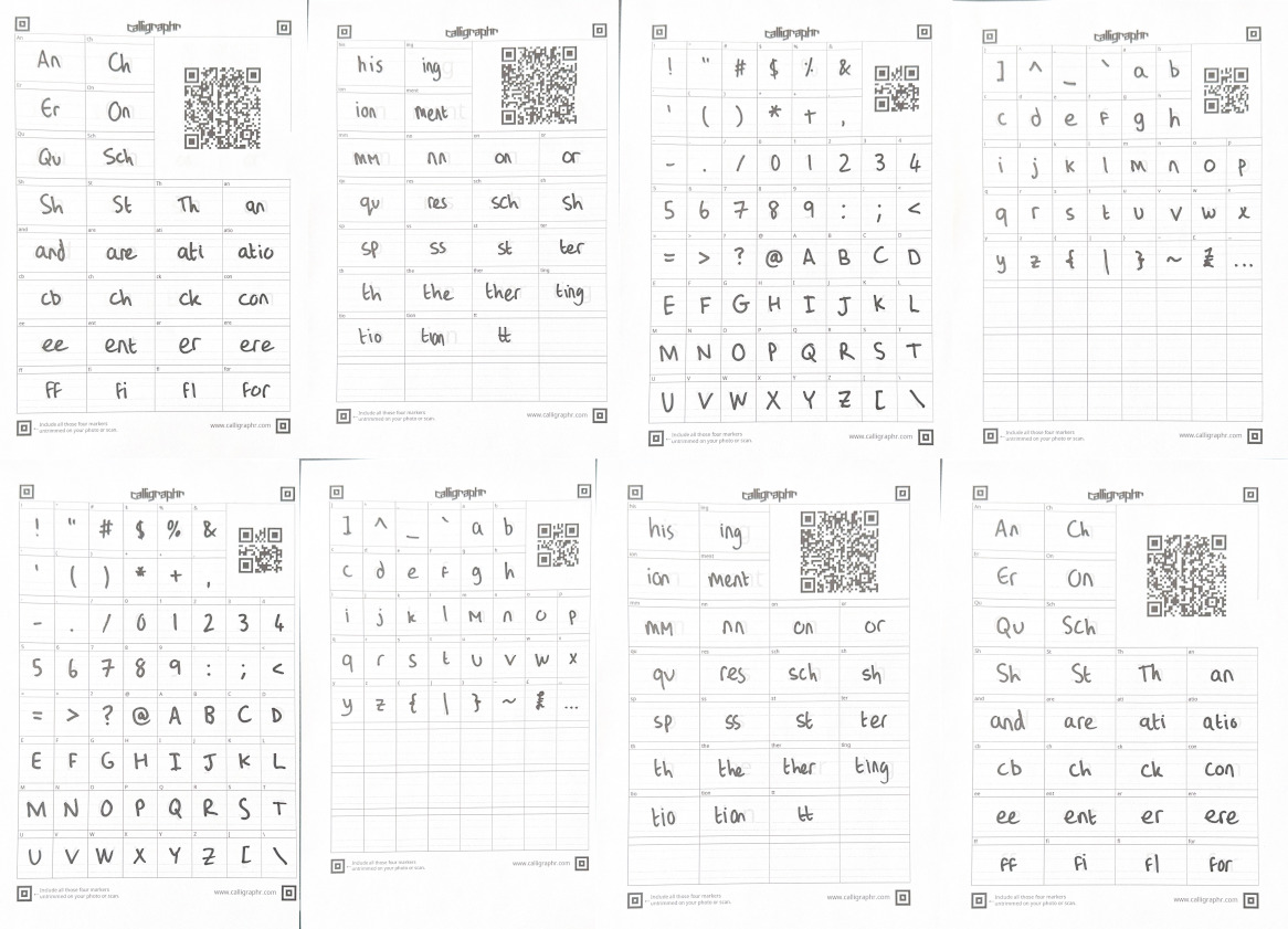
Most of the templates I used for the font
Calligraphr has a nice UI to generate the templates, allowing you to select which glyphs to include. I added the “minimal English”, “basic punctuation” and “Ligatures” sets. That gave me four pages to fill out, and I did them all twice. That let me filter out versions that didn’t work well, and have variants for some letters so the font wasn’t too repetitive. Later on, I went back and added some custom ligatures based on blog post titles that didn’t look quite right: “Re”, “To”, “ers”, “ey”, “hy”, “ra”, “re” and “ty”. Ligatures like this help it look more natural: when we write we don’t just stamp out identical letters regardless of their surroundings, instead they will connect to their neighbours, or overlap slightly, or even share a stroke.
I filled these templates in with a Sharpie, as I wanted a fairly informal, scrap-booky look, and it would also give good solid shapes that should be easy to pick out of the template. I scanned them with the “Scan Document” function on my iPhone, and uploaded the PDFs to Calligraphr.
Iterating and tweaking
The Calligraphr UI allows you to preview the font, but I found it a lot more useful to just download a copy and use it on a local copy of my website. That let me test it with real text, and see how it’d look at the different font sizes I use on the site.
The first version was not great. Despite the guidelines on the template, I apparently wasn’t good at sticking to them. Some letters were floating way off the baseline, and some were sunken below. When those opposites met it looked terrible. Fortunately Calligraphr has a pretty easy tool to slide each letter up and down, and scale it up or down if needed, and you can see it next to other letters as you do it. It took a little bit of time to go through all the variants of all the letters, but the next version looked a lot better.
Another tweak I ended up doing was reducing the spacing between letters. The defaults Calligraphr uses are probably good for a blocky font, but I wanted to put the letters close together to give it more of a joined-up look. Again, this is an easy tool to use, you just drag the sides in or out as desired. While these tweaking steps were probably as fiddly as some of the Inkscape steps I refused to do earlier, they’re a lot more rewarding as you see things improving with each one. It’s a lot easier for me to commit time and effort to improving something that’s already working reasonably, than put that time and energy into an unknown.
Later, I noticed that occasionally there would be a huge gap in a title. Not “the kerning is slightly off” but “there’s enough room to park a bus”. It took me a while to figure out what was happening: a couple of glyphs hadn’t been isolated perfectly and had picked up a few pixels from the template lines at the edge of their boxes. That meant the glyph had a width that covered the actual written glyph, a big gap, and then the rogue marks. At first, I fixed this by just adjusting the width, but that left the little pixels floating awkwardly down-sentence. The proper fix was to use the editing tool and simply delete them, and then Calligraphr snapped the width back to what it should be.
These iterations took a while to do, but I just dipped in and out occasionally over the course of a week, so it didn’t actually feel like too much work. I quite enjoy the process of refining things, too.
Result and a surprise
If you’re viewing this post on my website1, you can see the font in the headers, captions, and a few other places. Here’s how it compares to my actual handwriting:
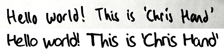
My handwriting vs my handwriting font
It’s not close enough to forge documents, but I think it definitely gets across my style, and that’s exactly what I wanted. It’s surprisingly legible even at smaller font sizes — I think the weight of the Sharpie helps here — and at £8 and a bit of manual work was a lot more economical than spending days wresting with open source tools.
A few weeks after I put the finishing touches on the font, I got an e-mail from Calligraphr. As my account had lapsed back to the free version, I was no longer eligible for the “server-side backup” feature. So what did they do? They e-mailed me an exported copy! It’s a JSON file with the properties of each glyph and a base64 encoded image. Not only can I re-upload this to Calligraphr if I resubscribe, I can probably hook something up to edit it should I ever need to. I’m blown away by how pro-user Calligraphr’s business practices are. They’re up-front about pricing, don’t try to get you stuck on an auto-renewing subscription, and automatically export your data. It’s like a breath of fresh air compared to the barrage of dark patterns that other websites foist on us. If you want to make this kind of font, I’d definitely recommend them just because of how nice they are.
-
And I haven’t changed everything since writing this post… ↩︎
Related posts

An app can be a ready meal
Three years ago I read “an app can be a home-cooked meal” by Robin Sloan. It’s a great article about how Robin cooked up an app for his family to replace a commercial one that died. It’s been stuck in my head ever since. It’s only recently that I’ve actually done anything like Robin described, though. Part of the reason was my brain got too hung up on the family...
Generating infinite avatars
I recently added a new ‘about’ section to the top of my website. Like most about pages, it has a picture. Instead of a normal photograph, however, you’ll see an AI-generated avatar. This is admittedly fairly trendy at the minute — apps like Lensa offer to make you profile pictures if you give them a set of photos and some cash — but I’ve done something a bit dif...
Monthly Meanderings: January 2026
Welcome to the second edition of my monthly meanderings. For a bit of context, you can check out the introduction to the first edition. Website updates It’s been a pretty busy month for chameth.com. Three blog posts: The Meaning of Life — an entry into the IndieWeb carnival where I mostly review a book on Stoicism — Surge Protectors: Marketing vs Reality which is a dump of a rese...
Recently I've been on a small campaign to try to make my personal website more… personal. Little ways to make it obvious it's _mine_ and _personal_, not just another piece of the boring corporate dy...