Tracking PBs without the dark patterns
Published on
I’ve recently been bitten by some kind of strange exercise bug. I’ve gone from being mostly sedentary to struggling to not go out for a cheeky bike ride on a day that’s meant to be a rest day. Maybe this is what a midlife crisis feels like?
Anyway, one of the things I’ve enjoyed about this development is seeing my personal best efforts gradually go up. There’s something incredibly rewarding about doing a run, and then seeing a nice little gold medal because as part of that you ran your fastest 1km ever. Unfortunately the only software I’ve found that does that is Strava, and boy do I not get on with it.
The many shortcomings of Strava
Strava is basically the app for running and cycling. Everyone talks about it. It sounds like they like it. But I really, really don’t. It’s like someone went through a catalogue of user-hostile behaviours and said “we’ll take them all!”.
The problems started in the setup wizard: it touts a load of privacy features, but doesn’t offer any way to enable them. All your activities are public by default, and you have to spelunk around in the settings to turn that off. I wasn’t actually sure if I wanted my activities to be public or not, and ended up flip-flopping around a bit. There is a clunky workflow to bulk change past activities, but it’s arbitrarily time-gated so you can’t use it too often…
The bulk operations are extremely limited, too: you can set the activity visibility, and your heart rate visibility, and that’s it. Want to bulk delete things? You’re out of luck. Bulk rename? No chance. You either do them one-by-one or use some janky third-party script. I think I pressed around 300 little ‘delete’ links in the course of trying to get my activity history imported in a way I liked.
Those problems give a bit of a signal about Strava’s priorities, but I could live with them. Once I’ve stopped faffing with the initial import I’m not really going to want to change the privacy settings or bulk edit things. Alas, the problems didn’t end there.
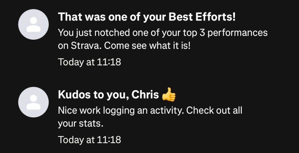
Look at me! Look at me! GIVE ME ENGAGEMENT!
The most obvious one is that everything is an upsell. Vast swathes of the app are premium-only, and they don’t ever get out of your way: they stick around acting as adverts. We’re all used to freemium apps that try to hawk upgrades, but the sheer amount of screen real estate taken up by these is egregious. I started a premium trial, expecting things to get a lot better, and… they didn’t really. All the premium features are still branded as such, so now instead of “look at what you could have if you paid us” it’s “look at what you’re getting for paying us (don’t even think about cancelling)”. Subscribing also makes your avatar get a premium outline, and there’s no way to disable it. I really hate that. Now I’m an advert myself. I don’t want to be part of their weird dark patterns, thank you very much.
And while we’re talking about dark patterns: there’s so much engagement bait that I physically cringe at it. You get a notification for logging an activity with a vague call to action to check it out. You get a separate notification when you break or come close to one of your PBs, but it doesn’t tell you which; there’s plenty of space in the notification for it, but they want you to hit the app instead. It all just feels so slimy to me. I don’t know whether it doesn’t bother other people as much, or if they’re desensitised to it, or just don’t realise how pleasant things could actually be.
Making a replacement
I realised pretty early on that if I only want automatic PB tracking, I could just write something myself to do it. I already use Health Auto Export to exfiltrate data from Apple Health, including workouts. I can just make a service that receives that data, crunches some numbers, and activates the dopamine receivers in my brain when I set a new record. But I didn’t really want to bother doing that if I could avoid it. I tried a whole slew of different apps and none of them did the thing, at least not without a subscription. And Strava had soured me on fitness subscriptions. I finally resigned myself to making something.
And by “myself” I mean “an LLM”. This is one of the first projects where I’ve not written a single line of code, and I’ve barely even reviewed anything produced by the LLM. I gave it an overall architecture and some sample data, and had it write a plan. I critiqued the plan, had it broken down into a few different phases, and then had it work through them. I occasionally stopped it when I saw it doing something stupid, and gave it a couple of technical steers, but my feedback has mostly been functional. I’m probably not going to be releasing it publicly any time soon for that reason — I don’t want to publish it under my name when I’ve not even looked at the code. I also wouldn’t be comfortable making software this way if other people were going to rely on it, but for non-critical, personal-use-only software I’m happy with the approach.
Anyway, I called it “Pompei Band”. Project names are hard. One of my common techniques is to put a term into an anagram finder; in this case “PB dopamine” anagrams to “Pompei Band”, and it even abbreviates to PB. Weird, but I like it. This is how it shows recent activities on the homepage:
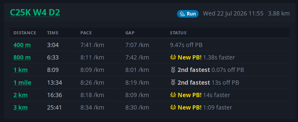
Dashboard entry for a recent run in PB
You can click through to see the standard activity details most tracking apps show: a map, heart rate, pace, gradient, and heart rate zones. You can also click on each effort to see a history of them, which gives a nice overview of progress:
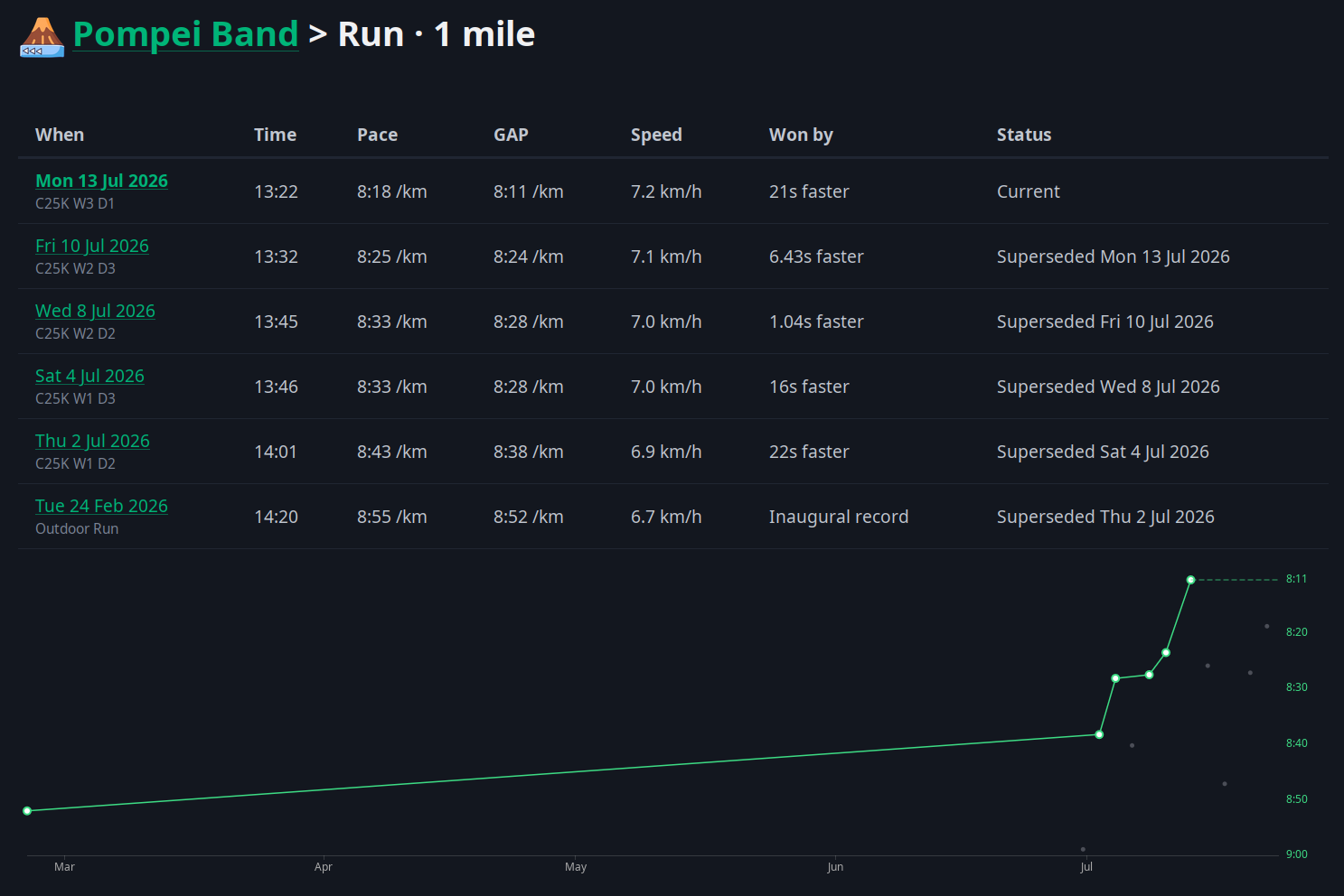
1 mile run PB history
It pretty much does exactly what I want, and has none of the annoying behaviours that Strava leans into. When I first drafted this post I wrote “there’s a few more bits I’d like to add at some point, but I can happily prompt them into existence when I want them”, but in the time I spent procrastinating before taking screenshots I ended up implementing them all. My favourite is this little history widget I added to the homepage, shown here next to Strava’s:
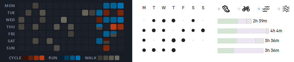
Recent activity calendar in Pompei Band and in Strava
The Strava one just confuses me. I’m not sure what the scale of the circles means. I’m guessing it’s time, which in effect means it just highlights my bike rides which are longer than runs. The colours for the line charts don’t work for me, and I’m not sure what three zig-zag lines are meant to represent. Pompei Band’s version uses distinct, obvious colours for different activities, and scales the brightness independently for each type of activity based on length (so long cycle rides don’t affect the short runs). I also flipped the axes so it looks more like a GitHub activity timeline, because that’s how my brain works. Nothing groundbreaking, but also none of the paper-cuts the Strava version inflicted on me.
Software doesn’t have to be awful
This blog post has been rattling around in my head for a few days. I didn’t want it to just be a litany about Strava being bad, and I didn’t want to sound like an LLM hype piece, which made it tricky to figure out what I was actually trying to say. I think the core of it is: software doesn’t have to be awful.
Everyone’s heard of enshittification, and it’s so prevalent that it’s easy to accept it as a fact of life. That’s just how late-stage capitalism works, right? But we can just make better software. And as LLMs slowly become more and more capable, that “we” grows to a broader and broader group. It’s easy to be negative about that: we’re going to drown in vibe-coded products, much like we’re already drowning in written LLM slop. On the other hand, a future where you can just say “make me single-player Strava without all the dark patterns” and get something that works just how you want it is pretty exciting.
The one thing I can’t decide: if everyone can whip up their own individual software, will the existing platforms actually improve? If Strava didn’t have all the dark patterns and engagement bait I would have just have paid for it. Will they realise that? Or will they double down even harder, try to lock you into their platform, and build moats around user data? Now I’ve said it, it seems pretty obvious they’ll try to do that. But I hope they won’t.
Related posts
Here are some semantically similar posts. Want to subscribe using a feed reader? You can build a feed with just posts similar to this one. Standard feeds are also available, but are approximately 42% less fun.

Monthly Meanderings: July 2026
Another month, another roundup post. This month has been very… exercise-y. Which is, for the record, not normal for me. For the previous year my only source of exercise has basically been walking, but that’s not a great fitness activity for me. When my regular walks entered the 10-15km territory it got more and more annoying to find the time and/or an interesting route. I also managed to i...
Building a family of single-user services
Last month I made and wrote about a personal service to track my workouts and record personal bests. Since then, things have escalated. I now have eight different services running in the same “family”:

An app can be a ready meal
Three years ago I read “an app can be a home-cooked meal” by Robin Sloan. It’s a great article about how Robin cooked up an app for his family to replace a commercial one that died. It’s been stuck in my head ever since. It’s only recently that I’ve actually done anything like Robin described, though. Part of the reason was my brain got too hung up on the family...
 MD87
#nobridge
MD87
#nobridge
I've recently been bitten by some kind of strange exercise bug. I've gone from being mostly sedentary to struggling to not go out for a cheeky bike ride on a day that's meant to be a rest day. Maybe t...